Scatter Plots: a brief Introduction
When you have to deal with a dataset containing lots of rows and multiple metrics,
Scatter Plots may be the solution to all your Viz problems.
With a Scatter Plot chart, you can plot all your rows/detail considering a minimum of 2
metrics (X and Y
coordinates) till a maximum of 4.
You may say: what could the other 2 metrics affect?
I shoud say: Size of your "plotted" shape, and eventually its color.
For example you shuold plot multiple circle (one for each row of yours) with a specific
size determined by a third metric, and a certain
color coming from a fourth metric (eg: gradient from worst to best).
Alternately, you could even bind colors to a dimensions.
Analysis
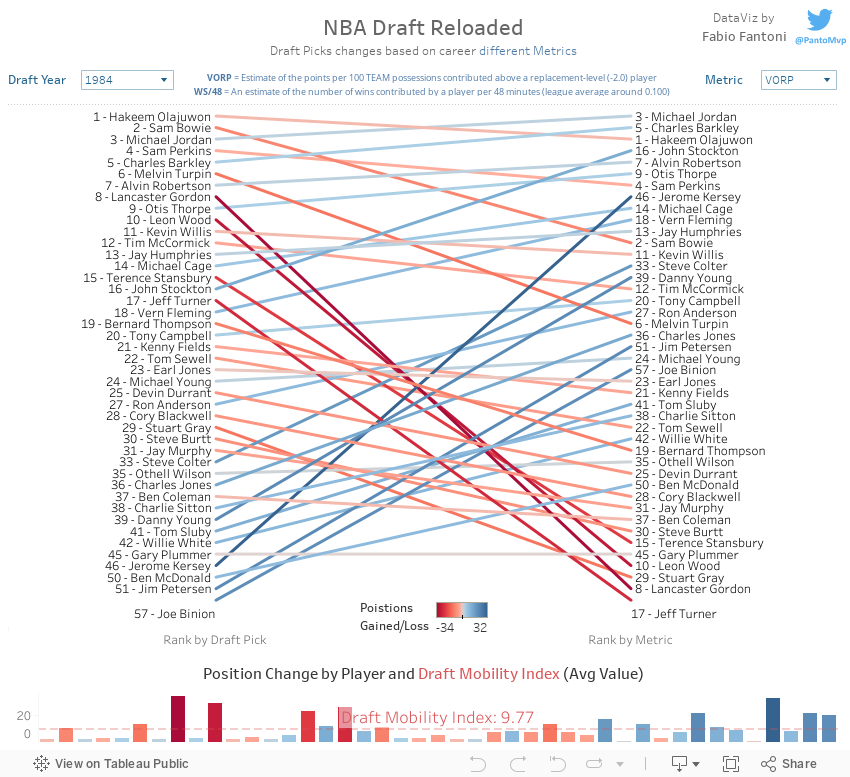
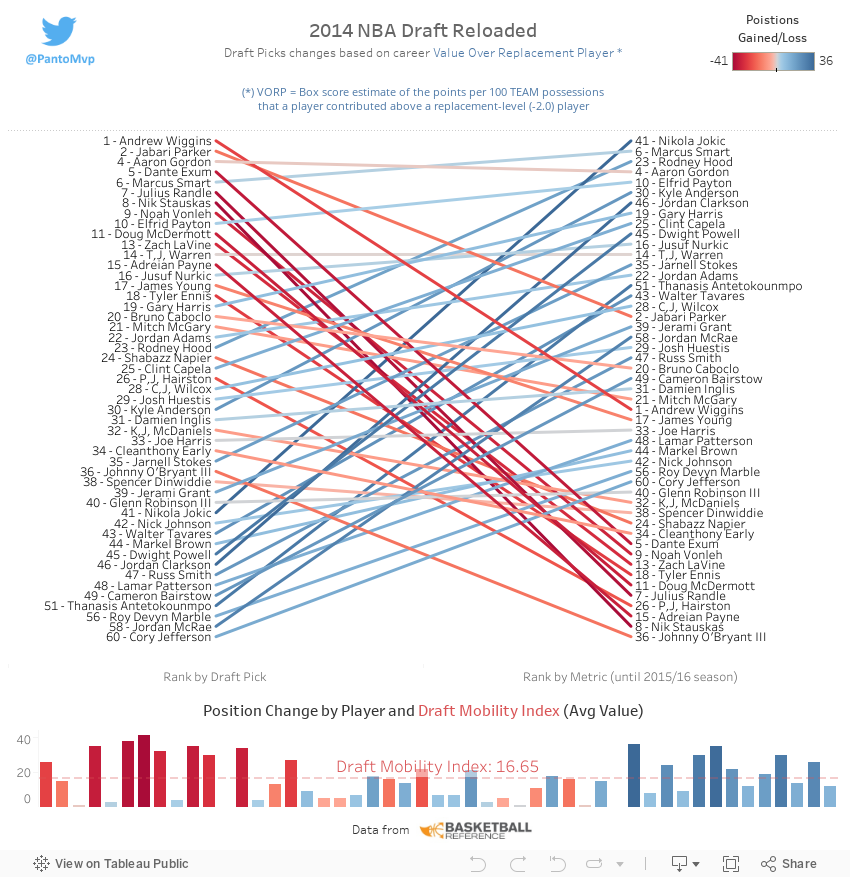
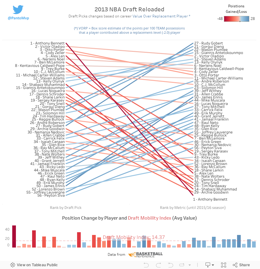
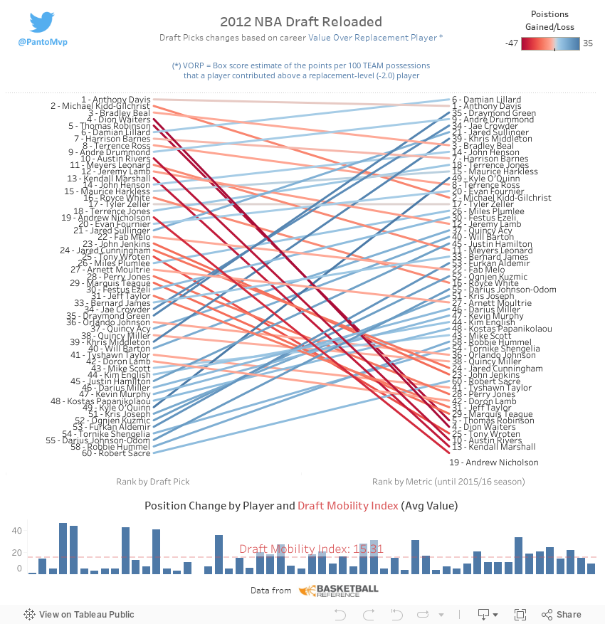
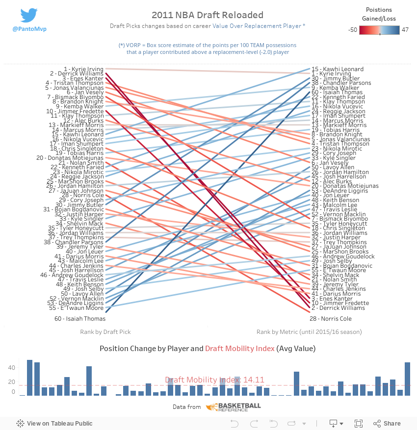
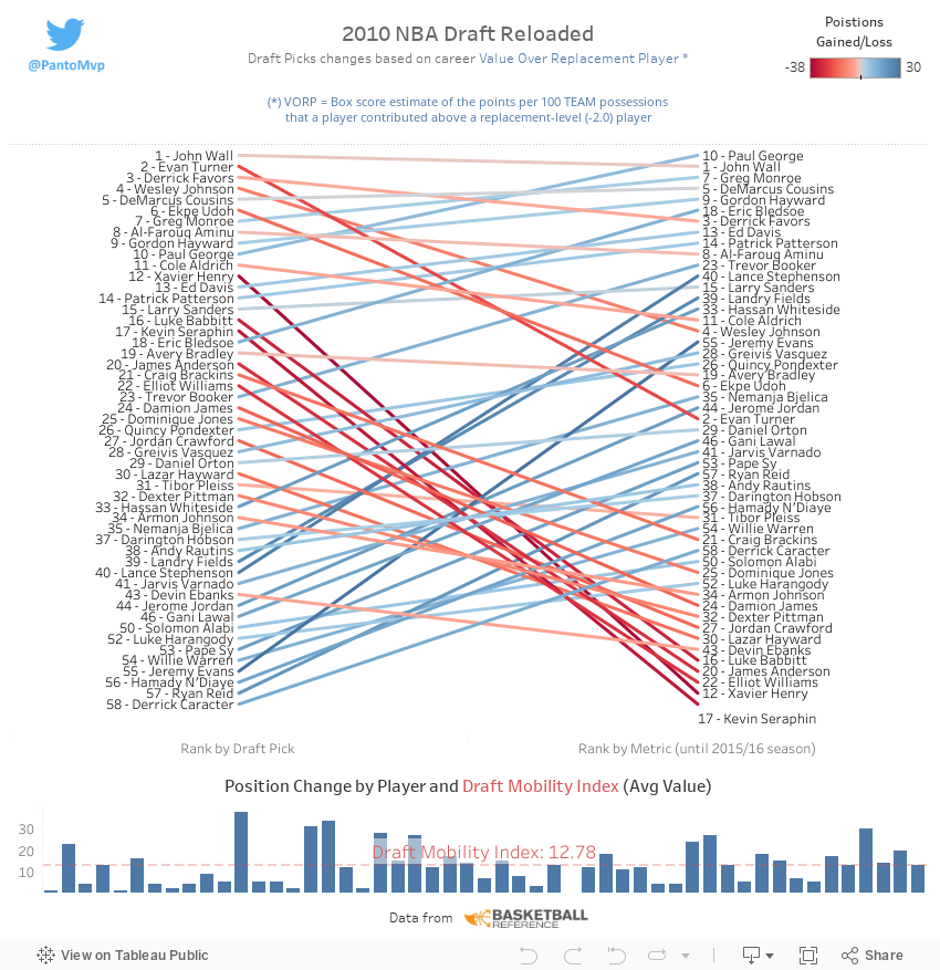
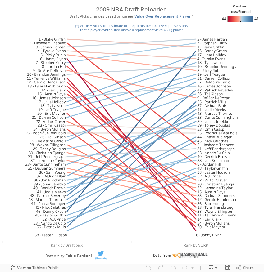
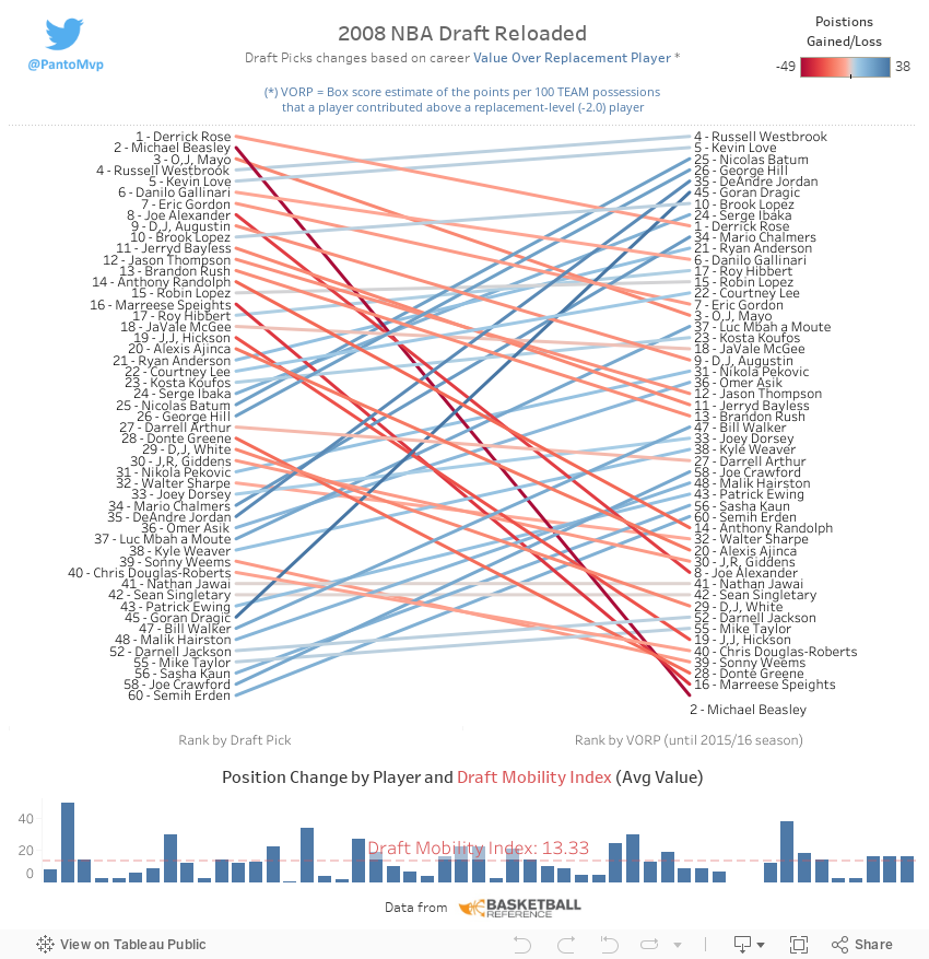
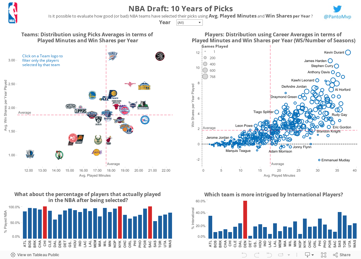
Is it possible to evaluate how good (or bad)
NBA teams have selected their
picks in the last 10 years?
I tried to answer this question using 2 very well known stats:
Avg. Minutes Played and
Wins Share per Year of every player drafted in this span of time.
With this assumption, the more a team (first scatter plot) or a player (second scatter plot) is on the top-right corner the more they are considered in a good position with high value for Avg. minutes played and hig Wins Share per Year.
On the other end, being in the bottom-left corner means that a team has selected low profile/impact players; meanwhile for a player means that his careers is just sub-par.
You can interact with the dashboard both selecting a year to
filter a specific draft class and clicking on teams
logo to consider just those players drafted by that team.