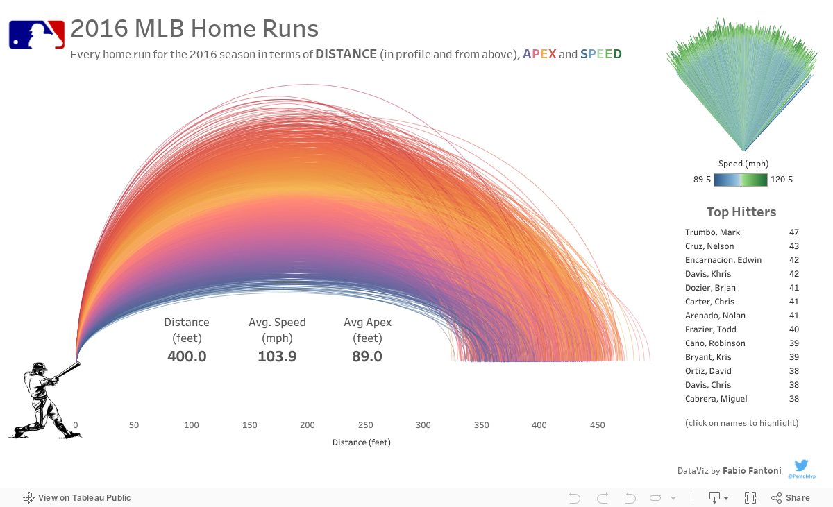
So due to my passion for Tableau I did some homework in order to understand how to create this type of chart and thinking about arches the first scenario that came to my mind was baseball.
After having found a dataset showing all the Home Runs for the 2016 MLB season, I decided to visualize the hit distance in profile combined with apex and from above combined with speed.
Clicking on the top hitters name will trigger an higlight to better visualize those players' Home runs among the others.
Nessun commento:
Posta un commento