Visualizzazione post con etichetta makeover monday. Mostra tutti i post
Visualizzazione post con etichetta makeover monday. Mostra tutti i post
domenica 22 ottobre 2017
venerdì 20 ottobre 2017
domenica 9 aprile 2017
lunedì 3 aprile 2017
domenica 19 marzo 2017

lunedì 7 novembre 2016
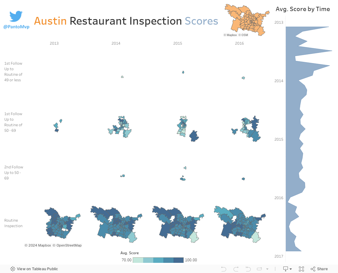
Austin Restaurant Inspection Scores
For this episode of MakeOver Monday, here's a look at Austin Restaurant Inspection Scores
lunedì 24 ottobre 2016
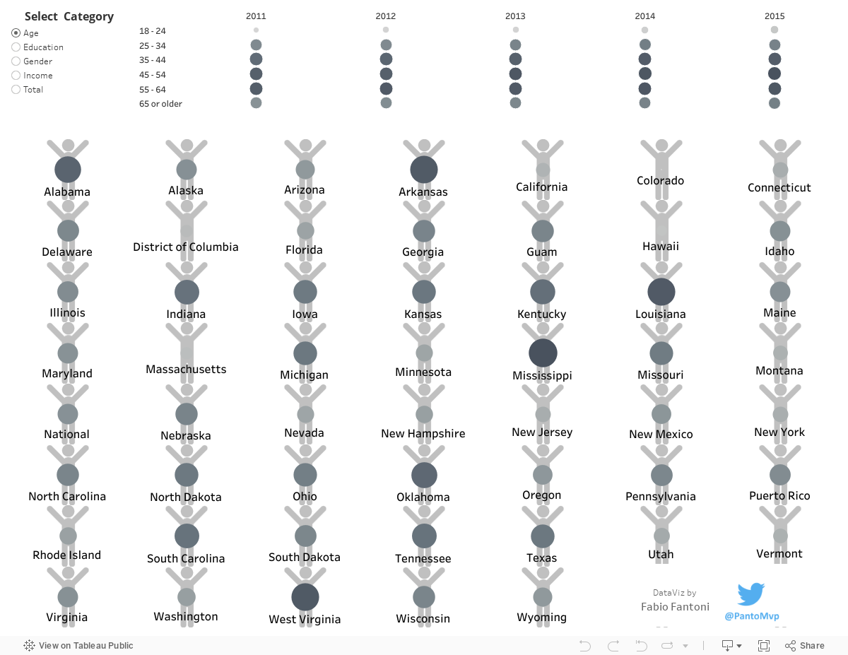
United States Debt
For this week MakeOver Monday edition, I had to produce a dataviz strating from the smallest dataset I've ever used:
2 rows with just one value.
You may say it's really simple... well it's not!
If you have small data, you can't make mistakes.
So I opted for home-made unichart and a donut chart to represent %'s values.
Here's the viz:

2 rows with just one value.
You may say it's really simple... well it's not!
If you have small data, you can't make mistakes.
So I opted for home-made unichart and a donut chart to represent %'s values.
Here's the viz:
martedì 18 ottobre 2016
USA Election: breaking news from the HEXagon
For this first post, I'd like to share my most recent Tableau dataViz project inspired by MakeOver Monday.
If you don't know this weekly contest, I suggest you to take a look at the link and give it a try.
Long Story Short: you have to share your personal idea starting with the same dataset coming from a previously published article.
The authors of this idea suggest to complete the work in less than 2 hours: the important thing is to communicate your own flavour, even if it's not perfect.
For this episode of MoM, the theme was USA Election.
The dataset was quite simple:
- 2 dimensions: Date (from April 1st to October 12nd) and State
- 4 metrics: Clinton, Trump, Other, Undecided (expressed as a % across the single row)
Since I've always been interested just in latest exit-pool, I decided to consider just the last date (October 12nd) for every state in order to have a sort What-If the election day was that date.
As you already known, USA have 52 states with completly different dimensions and sometimes filled map do not represent them in the best way because small states (eg: NY area) are always too small compared to big ones (eg: Texas).
So this time, I opted for a tiled grid map using the same size for every state which, by the way, displayed with hexagons, looks really cool for the USA (I can't say the same for Italy... already tried).
The only thing you need to have to realize this viz is a simple xlsx/csv file with the X/Y coordinate to plot every state in the right position.
I suggest you to pay attention to the shape you're going to use in order to adjust your coordinates: using hexagons, you may want to consider X-Y with decimals to create a sort of good looking beehive.
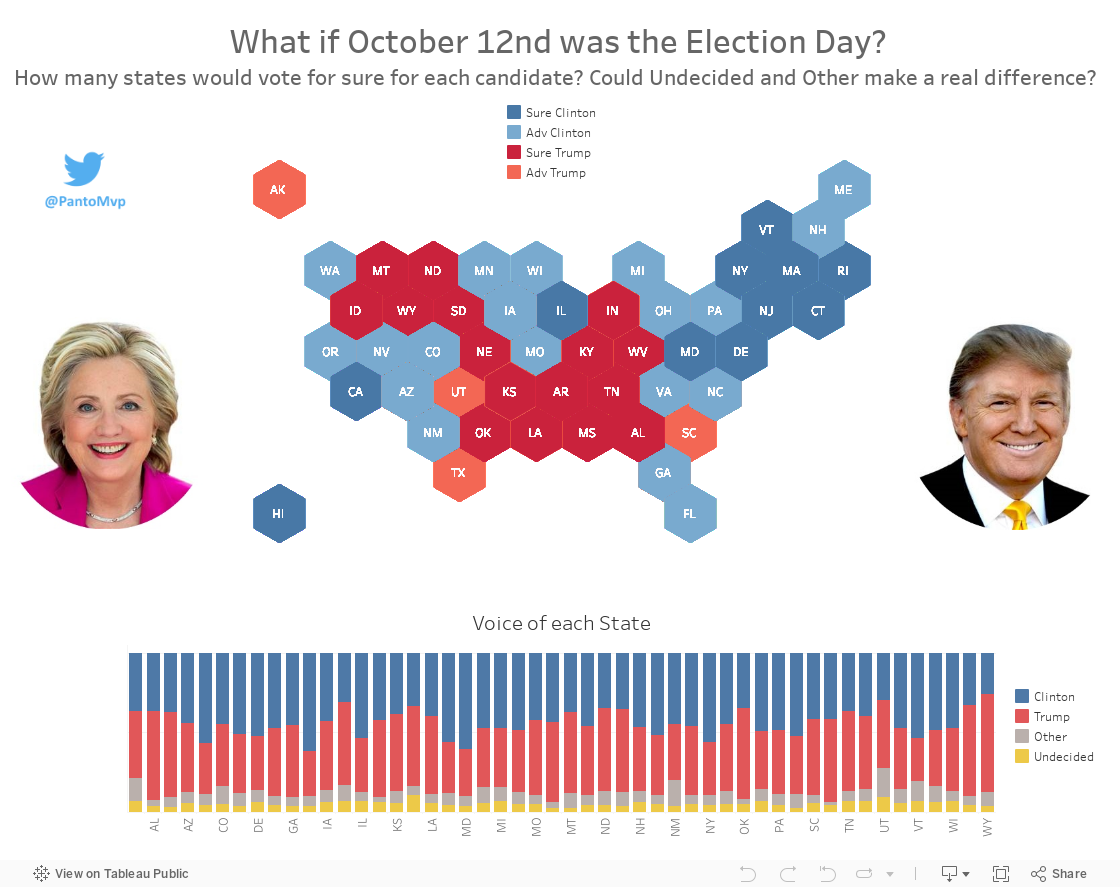
When I started this viz I wanted to show which states were a no-brainer for Clinton or Trump and find out the ones still in the middle of the process.
So basically, if the difference between Clinton and Trump %'s was greater than Undecided plus Other, a state went to the candidate with higher % (Blue or Red), otherwise the candidate with the higher % got the advantage (light Blue and light Red).
Quick and straight.
Is this the best way to visualize this dataset? Probably no, but It helped me answering my own question.
I think this should be the spirit of every viz!
I suggest you to pay attention to the shape you're going to use in order to adjust your coordinates: using hexagons, you may want to consider X-Y with decimals to create a sort of good looking beehive.
When I started this viz I wanted to show which states were a no-brainer for Clinton or Trump and find out the ones still in the middle of the process.
So basically, if the difference between Clinton and Trump %'s was greater than Undecided plus Other, a state went to the candidate with higher % (Blue or Red), otherwise the candidate with the higher % got the advantage (light Blue and light Red).
Quick and straight.
Is this the best way to visualize this dataset? Probably no, but It helped me answering my own question.
I think this should be the spirit of every viz!
Iscriviti a:
Post (Atom)